
Most weeknights end the same way for a lot of shoppers. They scroll TikTok for an hour, drift over to Reels for another twenty minutes, watch a creator review a pair of sneakers, and then open a brand's app to check the price. And that is where the room goes quiet.
The video that just held their attention was vertical, full bleed, instantly tappable, and shaped around their taste. The brand's app is a tidy grid of square product tiles arranged by category, with a hero banner from the last promo. Both screens are five inches wide. Only one of them is built for the way the shopper actually moves through the world now.
This is the Experience Gap, and it shows up everywhere in retail right now.
What the Experience Gap actually is
The Experience Gap is the distance between how social-native shoppers consume content and how most online stores present it. It is not the same problem as Context Blindness, which is about the data not reaching the screen. The Experience Gap is about the format of the screen itself. Even when a store knows exactly who the shopper is, it can still hand them a layout that feels like it was designed for a desktop browser in 2014.
Social platforms have spent the last decade training shoppers to expect a specific style of interaction. Vertical scroll. Full-screen visuals. Polls, swipes, and reactions you can do without leaving the surface. Shoppable moments that feel native to the content rather than bolted on top of it. Most retail apps did not get the memo. They still rely on static images, fixed grids, and one-direction product carousels. That format works fine if you arrived already knowing what you want. It does not work at all if you came in to be entertained, inspired, or sold to.
Why this is starting to bite
The numbers are quietly making this a bigger problem every quarter. TikTok users worldwide spend around 98 minutes per day on the app, with US adults logging almost 54 minutes daily, per Demandsage's 2026 roundup of eMarketer and platform-reported data. Users 18 to 24 push past 112 minutes a day. That is more time than most people spend on email, news, and music apps combined.
Meanwhile, mobile commerce now accounts for the majority of retail eCommerce, with eMarketer-tracked data putting global mobile commerce at around 59% of total online retail sales in 2025 and projected to push past 63% by 2028. The shopper is on their phone. Their attention has been trained by feed apps. And the store they tap into still asks them to behave like a desktop user.
McKinsey's research on personalization expectations found that 71% of consumers expect personalized interactions and 76% get frustrated when they do not get them. The same logic applies to interaction style. If the entire mobile experience around your app feels alive and the app itself does not, your store quietly becomes the boring building on the block.
What the gap actually costs you
The Experience Gap is hard to put on a single line of a P&L, but it shows up in three places that finance and marketing both feel.
Silent sessions. A shopper opens the app, taps once, and bounces. The session left no obvious trace in conversion data and no satisfying explanation. Most teams blame creative or pricing. Often it was neither. The shopper came in expecting to be pulled into something and met a wall of tiles instead.
Wasted acquisition cost. Paid traffic is more expensive every year. If the landing experience cannot hold attention long enough to do its job, every campaign is paying for traffic that bounces in the first ten seconds. The CFO sees a CAC line that keeps creeping up. The marketing team sees creative that performs well in the feed and dies on the landing surface.
Capped average order value. Static layouts are good at moving the items you already promoted. They are bad at sparking discovery. Without the cross-sells, the "shop the look" moments, and the editorial inspiration that social platforms made standard, the basket stays small.
"We added video" is not the same thing
The most common reflex when teams hear "social-native" is to add more video. Which is good, and not enough. Video is a content format. The Experience Gap is also an interaction format problem.
A video that auto-plays inside a static product grid still asks the shopper to behave like a 2014 eCommerce user. The fix is to match the interaction style too. Vertical, full-screen, tappable, swappable, snackable, with calls to action that live inside the content. Shoppers do not need to be taught that gesture. They have been doing it for two hours every evening for years.
What social-inspired commerce actually looks like inside an app
In practical terms, closing the Experience Gap usually means replacing static blocks with formats the shopper already knows from the rest of their phone. A few patterns worth knowing.
Stories at the top of the home screen, full-bleed, tap-through, with shoppable tags and quizzes built in. The Instagram-style UX is familiar enough that there is no learning curve, which means engagement starts at session one rather than session ten.
Video Feed for hero moments. TikTok-style vertical scroll, sitting inside the app where it can drive PDP views directly instead of bouncing the shopper out to a social platform that might keep them.
Swipe Cards for "this or that" comparisons, product picks, and quick personalized recommendations the shopper can interact with using one thumb.
Canvas for "shop the look" layouts and editorial moments that turn a static product page into a tappable scene.
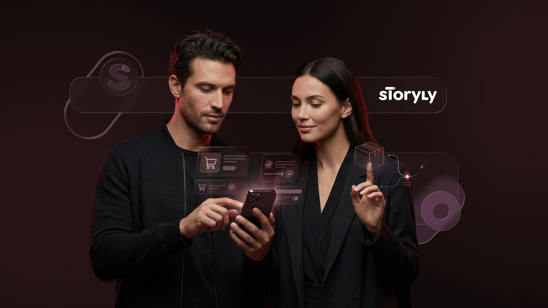
None of those are net-new ideas. They are the formats the rest of the shopper's phone runs on and all of these formats are ready to use in Storyly’s widget library. The only real question is whether your storefront speaks the same dialect.
A real example of the gap closing
Footasylum, the British street and sports fashion brand, hit exactly this problem out loud. Their content was performing well on social. Their own platforms were not getting the benefit. The brief was to bring that engaging content library into the app and website so the social momentum stayed inside the brand's owned channels.
They used Storyly and put Story Bar widgets on both the app and website homepages and let shoppers move from a swipe to a product page in one tap. The results landed: an 18% CTR uplift on the website homepage, an 8% conversion lift, a 21% drop in website exits, and more app downloads through gated exclusive content. The brand did not have to grow a new audience. It had to stop losing the audience it already had to platforms that were better at holding attention.
A short self-audit before you brief anyone
If you want a quick read on how wide the Experience Gap is on your own surface, walk through these on your phone, not your laptop.
- Open your app cold. In the first five seconds, is there anything that feels like content, or is it all navigation?
- Scroll the home screen once. Did anything move, react, or invite a swipe? Or did everything sit there waiting to be tapped on like a static page?
- Find your hero banner. Could you replace it with a Story or a Video Feed without losing the message? If yes, you might be paying premium real estate prices for a JPEG.
The brand strategist's read
Closing the Experience Gap is rarely framed as a brand problem because it sounds like a UX problem. It is both. The brand voice does not land if the format around it feels out of step with the rest of the shopper's phone. The same product, the same price, the same audience can land very differently depending on whether the surface feels alive.
The good news is that this is one of the few things in eCommerce where the fix is not more spend. It is more match. Match the format your shoppers spend most of their evening with, and let your existing creative and merchandising do their job in a space where attention is actually available.
If you want to see what closing the Experience Gap looks like inside an app, explore Storyly's Widget Library or talk to our team.


