

What is the purpose of the navigation menu in your app? Product managers pay special attention to mobile navigation since the available real estate of a mobile phone screen is limited. Mobile navigation usually should take very little screen space and be discoverable and accessible easily.
There are many different mobile app navigation patterns for different needs, and they all come with their good and bad sides. Let’s examine the basic mobile app navigation patterns and mobile navigation best practices.
What is Mobile Navigation?
Mobile navigation refers to the process of moving around and interacting with the various features of a mobile application or website using a smartphone or tablet device. It involves using menus, buttons, icons, and other user interface elements to access different pages or sections of the app or site, as well as performing various actions such as searching, filtering, and sorting content. The goal of mobile navigation is to provide users with a seamless and intuitive experience that allows them to quickly and easily find the information or functionality they need.
Why is Mobile Navigation Important?
Mobile navigation is important because it allows users to easily find and access the content they are looking for on a mobile device. Good mobile navigation makes it simple and intuitive for users to move around a website or app, improving their overall experience and reducing frustration. With more and more people using mobile devices for browsing, it's crucial for websites and apps to have effective mobile navigation in order to provide a positive user experience and keep users engaged.
Mobile App Navigation Patterns
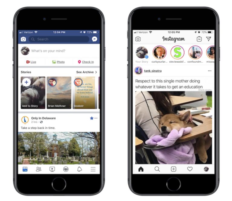
1.Navigation Menu (Hamburger Menu)
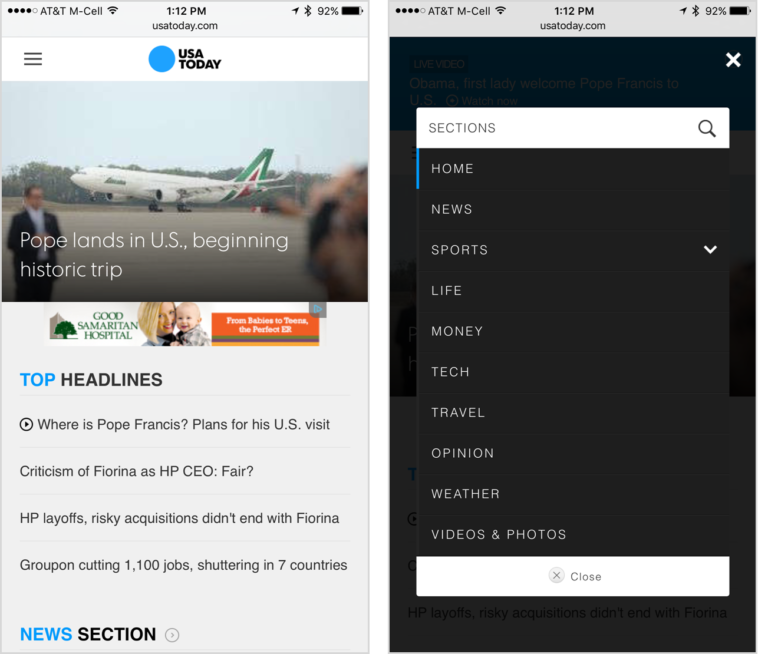
Navigation menus, also known as hamburger menus, include an icon that has a hamburger-like shape with three horizontal lines. While using the app, people do not see the menu section since it is hidden. They can click the hamburger button and open up the menu to navigate through the app.
Navigation menus provide a large space for content in a small place with a clean and clear design. However, when the navigation is hidden, users are less likely to use it even though these menus are very popular. So, the navigation menus or hamburger menus are the least discoverable.
Another downside of hamburger menus is that they clash with some platform rules. Although hamburger menus are trendy among Android apps, they may overload the top navigation bar in iOS. Also, users might need to swipe the screen right to access some hamburger menus, which is problematic for iOS users since the same gesture means “back.”

Hamburger menus are traditionally placed on the left top part of the screens. This practice makes it harder for right-handed users to reach the icon since mobile phone sizes are getting bigger and bigger.

While containing many contents, hamburger menus hide the other screens when the user opens them. So, the user can’t see the current section of the app that they were using before clicking the hamburger button. In such a case, they may need to go back to check what they were doing, tap the hamburger menu again, and tap the icon of the page they want to go. This process requires extra effort, even without losing the context.

More visible mobile navigation menu options increase user engagement and experience overall. The out of sight, out of mind rule works in mobile app navigation. Hence, you should keep that in mind and prioritize your content accordingly. For example, you shouldn’t use hamburger menus as your main navigation menu. While you are using a hamburger menu in your app, support it with other types of navigation elements. To improve your navigation menu, you can place it on a tab bar to make it more accessible. You can also directly export the navigation menu’s contents to the tab bar if you don’t have much content.
2.Tab Bars
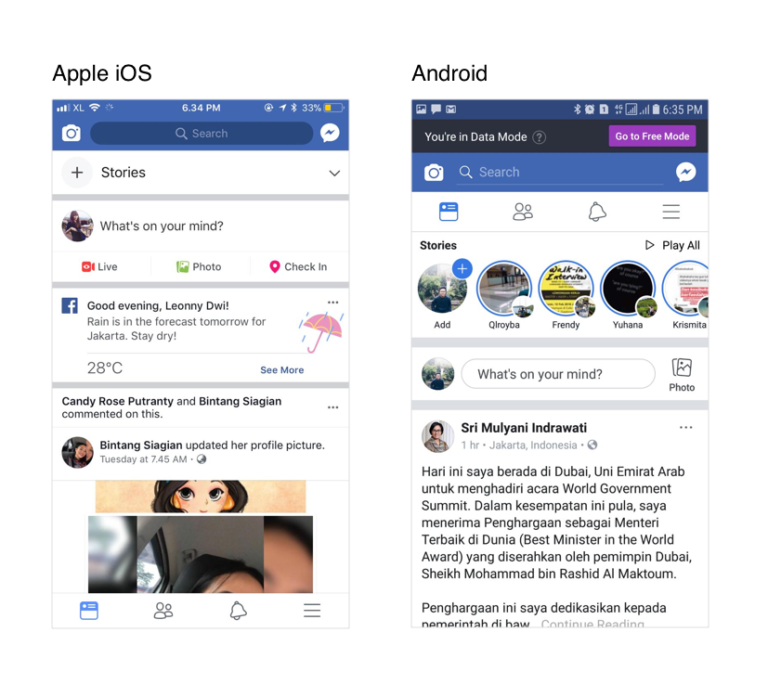
Tab bars appear at the top (generally on Android apps) or the bottom (generally on iOS apps) of the screen. As the name suggests, they appear in the form of a bar including various buttons to which users can tap to go to another screen. This type of mobile navigation comes from desktop designs, and they take valuable real estate on the screen.
If we are to make a small comparison of hamburger menu vs tab bar, the main difference is whether you decide to have the navigation items visible on the screen all the time. Tab bars with or without icons don’t hide the navigation and the content. It helps them easily communicate with the users. Since they stick on the screen, users can see the tab bars even if they scroll up and down or change the page. With this last feature, they are different from navigation bars. Navigation bars are usually present at the top of the page as a start but disappear once the users commence scrolling.
One of the downsides of tab bars is that they have a limited capacity for content to carry. Generally, if you have more than five options, tab bars aren’t as effective. Some apps use carousels on tab bars; however, remember that out of sight, out of mind. Especially if the options are irrelevant, it would be hard for users to find the options on a carousel tab bar.

When it comes to using tab bars for mobile navigation, you should keep in mind that the size of the touch target is still significant as it is on any other part of your app. The size of our fingerpads and fingertips are, on average, between 10-14mm and 10mm x 10mm. Making these measures a minimum touch target size is essential.
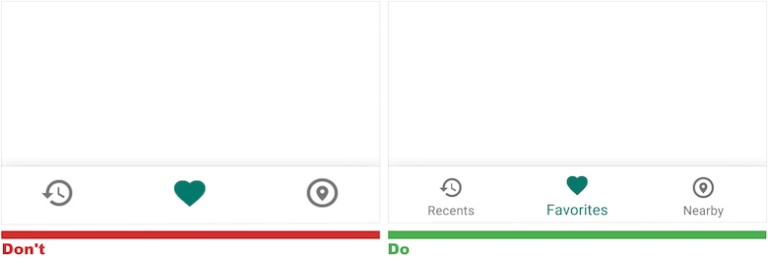
On tab bars, be as clear as you can with the labels and icons. Use familiar language and icons to ease communication and eliminate ambiguity. Users should be able to understand quickly where that option takes them. If it takes more than 5 seconds to understand the function of a particular icon, then the effectiveness of that tab is low.
When you place a tab bar on your app, you should order the navigation to reflect the priority of the tabs. In the essence of the tab bar, the user is active on one of the tabs, and it should be clear and visually highlighted which one that is.
3.Full-Screen Navigation
Full-screen navigation lists all the navigation options on one page, usually on the homepage. It allows users to follow a clear path of mobile navigation with simplicity and coherence. Full-screen mobile menu is very efficient in task-based and direction-based apps where users usually complete one task during one session.

Although full-screen navigation allows users to consume content without distraction, you cannot display any other content because the real estate is occupied with it. However, you can consider putting a hamburger menu to show additional options.
4.Floating Action Buttons
Floating action buttons (FAB) are generally shaped like a circle and not surprisingly float over the interface. Google says that FABs promote user action since users understand these buttons as a wayfinding tool. When users see an unfamiliar screen, they will use FABs to know where they are and what to do next.

FABs show the users what is important. So you can use them to prioritize your content. You can use them to increase user engagement and boost the design of your app. FABs, as a mobile navigation pattern, can be one of the core elements in your app.

Although FABs take little space on the screen, they can distract users from your content and even block your content because they are colorful and float.
Don’t use FABs on every screen on your app. It is a good idea to use one FAB per screen to show the importance. Be sure that this FAB refers only to positive actions such as “create, favorite, search” and not negative activities such as “delete.”
5.Search
Search is an indubitably important part of mobile app navigation. It has many uses, especially in content-based, e-commerce, productivity, and listing apps. The design of location, size, and color of a search bar, tab, or icon should depend on the application’s purpose.
A well-functioning search feature saves users a lot of time and improves the user experience.
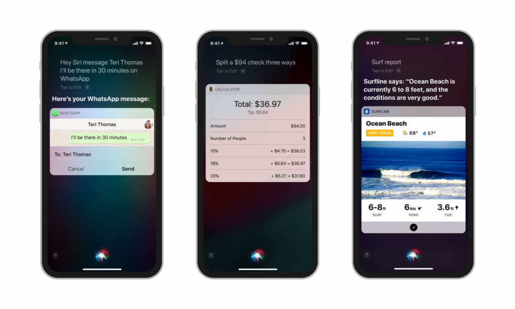
6.Voice
Voice recognition is still a developing technology. However, your app can benefit from this rising trend by responding to voice commands to become more accessible. To do this, the user first needs to give voice input to the application to be recognized. Then, they can navigate through the mobile app without any necessity to look for menus, bars, and icons. Also, mobile navigation through voice eliminates the need for typing. Some business customers may already have experienced what speech recognition can provide.
7.Gesture-Based Navigation
From the introduction of touchscreens into our lives, gestures became popular quickly among users, designers, and product managers.
Gesture-based mobile navigation is effective, especially when we are looking for content details. It reduces the interface clutter and doesn’t take the screen real estate.
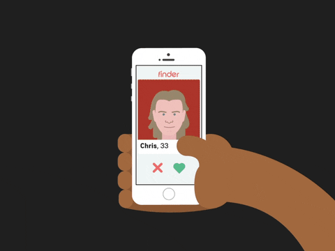
With gesture-based navigation, the user interface is more intuitive. According to a study, gestures tend to be similar across cultures and experiences. In this study, 40 people from 9 different countries were asked to perform gestures for particular tasks. For example, the most common gesture to “delete” was dragging it off the screen.
Some of the apps use gesture-based navigation as a different feature. Tinder popularized swiping left and right, and other dating apps followed.
One of the disadvantages of gesture-based navigation is that it is invisible. Visibility is essential when it comes to the user interface to ease discoverability. This invisibility may add up to the learning curve and distort the user experience.
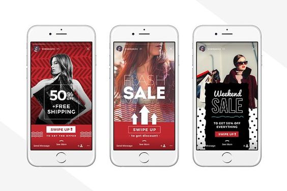
Make sure that your users are educated about the gestures. Also, put the maximum amount of attention to using familiar gestures. For example, Snapchat popularized stories and usage. Swiping right to see the following story allows users to navigate through content in the full-screen form. And swiping up takes the user to the deep-linked page. Users are familiar with how to use stories and deep links, so many apps adapted the story format. If you want to discover how you can use stories in your app, check Storyly.
Best Practices of Mobile App Navigation
Making navigation discoverable and accessible is a challenge due to mobile screen sizes. Product managers try to improve the situation with different navigation patterns. The most crucial indicator of such an improvement is your business goals and user expectations. Keeping these particular requirements in mind, you can see the mobile menu best practices below:
1) Keep Is as Small as Possible
Even for the biggest smartphones, the screen size is somewhere between 6-7 inches. Since it is still pretty small, you need to think wisely about the navigation pattern you plan to choose. Whereas hiding the menu through a hamburger button creates room for more content, it also has the risk of decreasing user engagement. Users are too occupied with everything they might see on their devices and do not have time to look for a menu. Gesture-based navigation, tab bars, or floating buttons, on the other hand, are small and accessible. However, they can include only a limited number of actions.
2) Always Make It Possible to Go Back
Especially new users might not have the right idea about where any navigation element will take them. So they will give it a try and want to see it by themselves. However, they might end up on a screen that they did not want to go. Thus, always give them a one-tap option to go back.
3) Make It Easy on the Eye
Here comes a basic and essential design tip: Create a contrast between the background and the text. Users should not need to make extra effort to read what you have to say them.
4) Inform Your Users About the Progress
Do you have progress bars on your app? If the answer is no, you should definitely think about integrating these elements. Especially while you are guiding your users through a process composed of multiple steps, you need to inform them about at which stage they are and how long they need to continue.
5) Onboard Your Users to the Navigation Method You Use
The mobile world is such a great example of the greatness of our learning capabilities. Yet, we all need a quick tutorial on how to do certain things. Why not provide these tips to your users in the very beginning? Include brief and clear information about the app navigation in the new user onboarding process.
6) Don’t Make Your Users Scroll Down for Too Long
The vertical design of mobile devices makes it necessary for mobile apps to include some scrollable content. However, you need to remember that any current or potential user has time and curiosity to keep scrolling for minutes. If you don’t want to lose them along the way, mix and match scrollable content with tappable content. This is why in-app stories offer a user-friendly and immersive experience suitable to mobile app navigation best practices.


